Don’t Miss Our Weekly Posts
We pull back the dealership curtain and help you buy from anyone or anywhere.
Nonsense free.
One click unsubscribe. We passionately protect your data. Privacy Policy
"Hi this is Dennis from Wheel Kinetics."
"... Wheel what??"
After many years I had enough. What started as a college brand to sell wheels for race cars had, literally, run its course. We needed to rebrand.
We took the rebrand in four steps: (1) define us and our customers; (2) choose a name; (3) select brand messaging and brand tone; (4) create a visual identity.
This blog post details the whats and the whys on our exciting journey to Crosscut!
Who are we and who are our customers?
We are direct, lean, and passionate. Our customers want simplicity, honesty, and value.
We hired Jon Persson, Brand Identity Designer at CultMethod, to create our new brand.
He peppered us with questions to know ourselves and our customers better. For example, if our customers go out for a drink, what do they order? What kind of jeans do they wear?
And who are we? What do we care about? Why should anyone buy from us?
With those answers, Jon created our Brand Brief. It's what we are about and what our customers want.

So many names to choose from, so much cringe.
Tl;dr: Crosscut — like Shortcut, but without the negative vibes.
Jon suggested a book from marketing guru Alexandra Watkins for a name-selecting guide.
Our new name should suggest our brand, resonate with our audience, connect visually to aid in memory, go beyond its literal meaning, and evoke some kind of emotion. The name also shouldn't be hard to pronounce, have insider meaning, or be hard to spell. (Wheel Kinetics failed all three!)
After brainstorming thousands of candidates our finalists were: Tailwind, Slingshot, Ember, Lemonade, Carscape, and Crosscut. And the winner was... Slingshot!
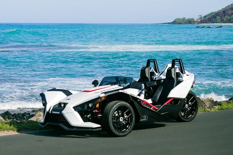
But we had a problem, a "Polaris Slingshot" problem. The goofy three wheeled, destined for the scrap heap of bad automotive ideas abomination, spoiled our selection.
We couldn't guarantee ranking in Google searches for "Slingshot" and its car derivatives. It is not wise not to go up against a billion dollar brand if you want to control Google searches for your brand name.

We liked Lemonade but customers found it too cringy (like "Vroom" or "Carvana") and thought we sold lemon cars (...really?). We rejected Tailwind as too off-brand because it suggests a helpful mentor pushing you along, but we are a mostly hands off experience. Carscape is too generic. Ember almost made it as an "empty vessel" name — a name where you can insert your own meaning, like Nike for shoes or Apple for computers — but it ultimately felt too cuddly.
Then we landed on Crosscut. It is similar in meaning to "shortcut" but without the negatives, i.e. taking "shortcuts" in vehicle inspections. Crosscut is edgy (literally!) and sounds sharp and error-free. There's no fluff, just precision. Perfect!
Now to brand and message Crosscut
We Hate Nonsense
It's true. But can we really use "hate" in a tagline? Branding guru Jon insisted.
"Taming it down is off brand. You really do hate nonsense. 'Enough nonsense' sounds childish, plus dealers have tried to corner this "no bs" market with euphemisms like 'No Bull.' Dealers claim to be no nonsense by inventing a nonsense term. No. You hate nonsense, you are going to say it directly without nonsense or you're just like them."
Yikes. Consider us shoved from the bird's nest. We hate nonsense.
How do we communicate that visually?
Bold or earthy: Can't we be both?
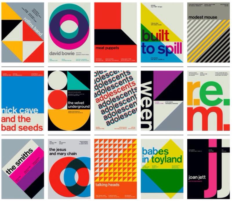
Jon created two incredible style scapes for our new brand look. Both are heavily inspired by Swiss Style

The first is bold with vibrant colors and a modern font.

And the second is more "Earthy" with a monospaced body font and muted tones.

I liked the fonts of the earthy with the bold color palette. I wanted to combine both.
But Jon pushed back against the combination — the designs aren't severable. I liked the earthy color palette well enough, but I was enamored by the typefaces. They're distinctive, modern, and straight forward. Earthy it is.
But what is that logo?
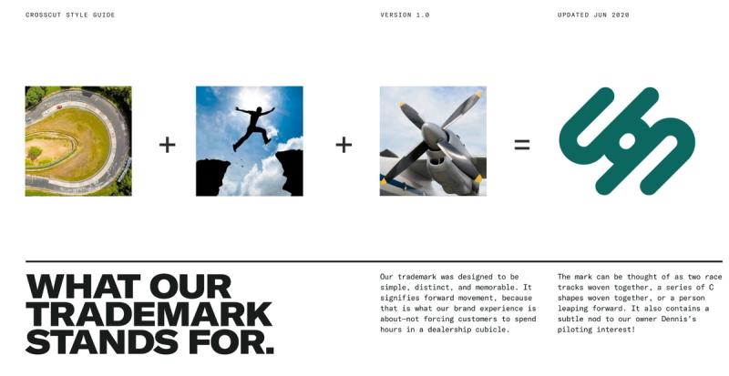
We wanted a distinct logo that contrasted our earthy tone with something fun and hip. Jon delivered! It reminds me of a cool California surfing company logo. I like the tension it creates with our more muted style guide and monospaced typography.
Here's how Jon describes the logo...

Redesigned Website: A fresh take on the old web
Now to distill it all into practice. Jon created mock pages and I turned it into code. The Crosscut site is built on top of the old Wheel Kinetics codebase with many technical upgrades behind the scenes.
I want to bring our customers a better experience than even the best sites. Our tech stack is based on NextJS/React, Typescript, Node, and GraphQL. It uses advanced routing and Algolia for lightning fast searches that even preserve your scroll position (there's nothing worse than looking at a list of products, selecting a product, and then losing your position in the list page when you go back).
I've put over 10,000 hours into this site and it's all to show our customers vehicles in their gory detail, both good and bad. None of the existing commercial solutions let us show vehicles with all of their warts so we had to create our own.
It also features a first of its kind online negotiation, document signing, and coming soon online financing and payment!
Expanding the Brand, Crosscut in 2022 and Beyond
Expect a lot of great Crosscut content in the months ahead. I'm blogging and YouTube-ing, covering the top customer negotiation mistakes, if buying sight unseen is good for you, why dealers are so hated and how to ensure a good experience, and other vehicle topics. I'll also be covering tech topics like how we create certain features and we will build a salesman-less test drive system in public.
We'll also have a great social media presence. We looked to other dealerships for inspiration but found mostly hostage-esque "new customer and their car" pictures. And, predictably, those got low engagement.
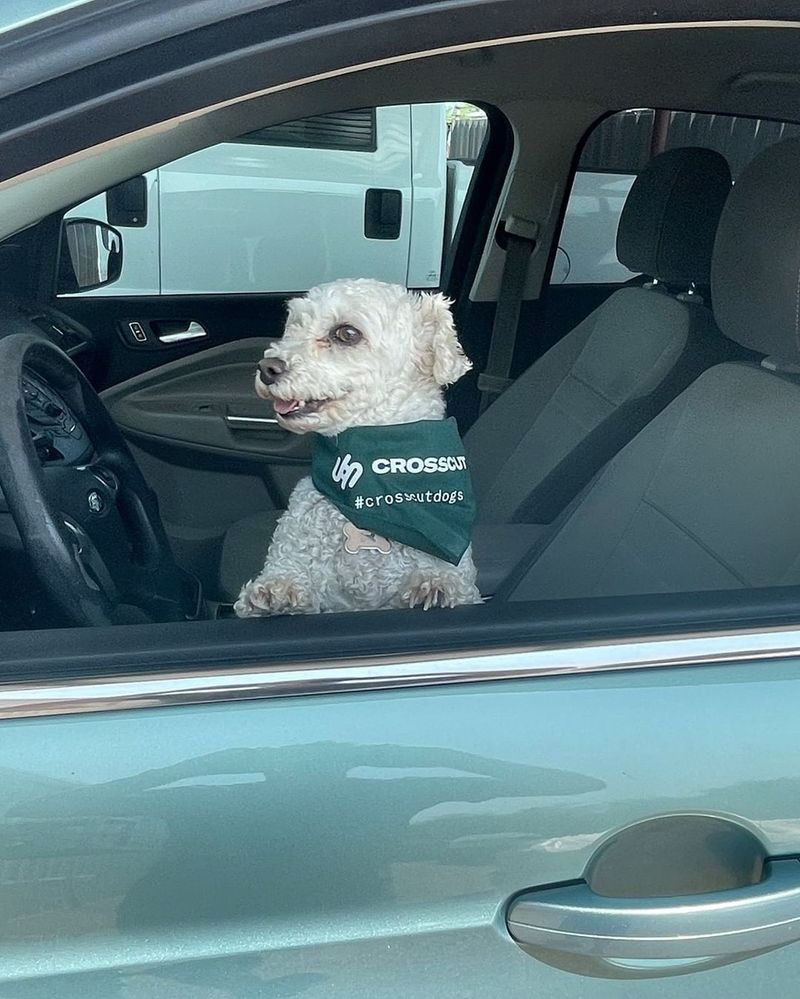
The dealers with high engagement largely wrapped themselves in bikinis, lifted trucks, and 'Merica. We like those things too but that's not our brand. At Crosscut, we are huge dog lovers. We think teaming with our customer's pets for pictures of their new rides and donating to local shelters for each picture will be fun and help animals in need.

Our customers will also have the option of free swag! (a Yeti/Crosscut tumbler anyone??)
We hope our customers embrace this new direction and brand as we relentlessly push for more transparency, value, and ease in car buying.
Always straight to the point and hating nonsense.
Let us know your thoughts! What would you have done differently?
Want to keep up with Dennis's work? Follow Dennis on Twitter →
